Web design has always been about having the right information easily available, no more so than now, and no matter whether you’re an FMCG or a financial services brand.
If your customers can’t find what they need on your website quickly, then no amount of expensive photography, deep content or on-brand graphic design will keep them there. As a back-to-basics reminder, here are 7 essential considerations for re-designing your website so it’s stylish, full of substance and built around consumer needs.
1. Get the thinking done first (before the pretties)
All websites should be based on business goals and user needs. After you’ve figured out the scope of the project, a sitemap and wireframes for each page are important, so you can see how individual pages flow and function. Note that this might include the ability to create one-off campaign landing pages.
Only when those elements are agreed, can you think about how to make it look pretty, with typography, photography, custom illustration, dynamic video and graphics. Even then, there’s more to consider, as per our list below:
2. Be mobile first / responsive
50% of global website traffic is now coming from smartphones and there are now more searches being conducted on mobile devices than desktop browsers. That’s why Google rolled out mobile-first indexing back in 2018, which means mobile-friendly content will usually be ranked higher in search results when the user is searching on their mobile.
Google wants you to make your website responsive and enhance the experience for mobile users. Your USERS want you to make your website mobile friendly (and tablet friendly). That needs to be built into your design from day one.
3. Don’t make ‘em wait, especially on mobile
Redesign your website to have a fast loading time for all users on all devices, even the users who might have slow internet connections. Compressing images and text is a good starting point.
Again, be desktop and mobile friendly. If your homepage takes too long to download on mobile, it will impact your traffic and conversions. Google’s already confirmed that 53% of mobile site visits leave a page that takes longer than three seconds to load. Google’s research shows that as page-load time increases from one second to 10 seconds, the probability of a mobile site visitor bouncing increases 123%.
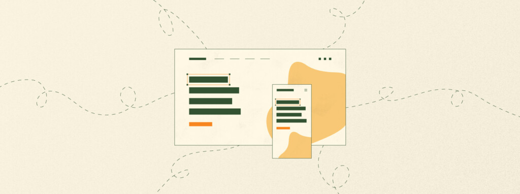
4. Set up home page hierarchies
The fundamental principles of website design never go away.
And visual hierarchy on your home page is one of them. This requires you to prioritise which features are most important, whether that’s a form, a call to action or key menu items. Set this up using size, placement, colour etc. to rank the features – most of this you can do in the wireframes. Base this on your analytics – what are your customers most frequently searching for?
NB. Your call to action should be really obvious to drive conversions, and it should be on every interior page as well as the home page. And it should be consistent, to reinforce the message each time.
5. Don’t get carried away with your navigation
There are plenty of web design trends and exciting new design templates out there. But consumers aren’t driving these trends, template companies are. Consumers just want to find what they’re looking for quickly.
When you’re wireframing don’t make your navigation too complex: stick to the standard menu formats – people respond to what’s familiar.
Try not to have too many options in the menu, or like a big menu in a restaurant, it will confuse people. If you do need to have a lot of menu items use a system of menu filters so people can sift through the layers.
6. Declutter, declutter, declutter
Less is more. Including words, which is where good copywriters come in. Tell your story in as few words as possible on each page. Blog articles or white papers can be more dense, but your web pages shouldn’t assault people with columns of text.
Smaller amounts of text allow you to have more white space (or negative space) on the page, between the visuals and the words. This allows users to more easily focus on the items you’ve identified as priority on each page, (using your visual hierarchies), and make them easier to read – which is important in an era of information overload.
Fewer distractions make for a good user experience. Cleaner designs generally look more sophisticated too.
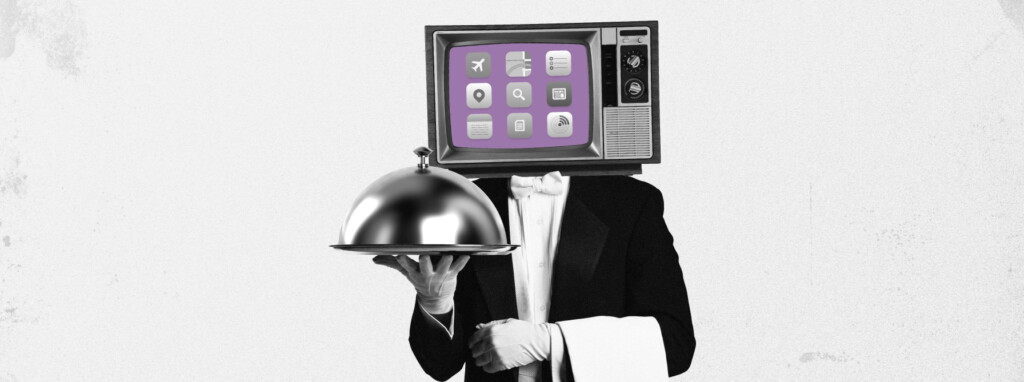
7. Use visuals that say something
Pics are great for looking pretty and breaking up text, but don’t pick purely decorative images or graphics. Choose or design images that communicate the ideas you’re trying to communicate – which means you can have less text.
And before we go, UX guru Peter Morville has a neat matrix of criteria you might find useful to tick off as you re-design. Ask: Is your content useful, your website usable, your design desirable (emotionally), your information findable, credible, valuable and accessible (i.e., inclusive) to the end user?