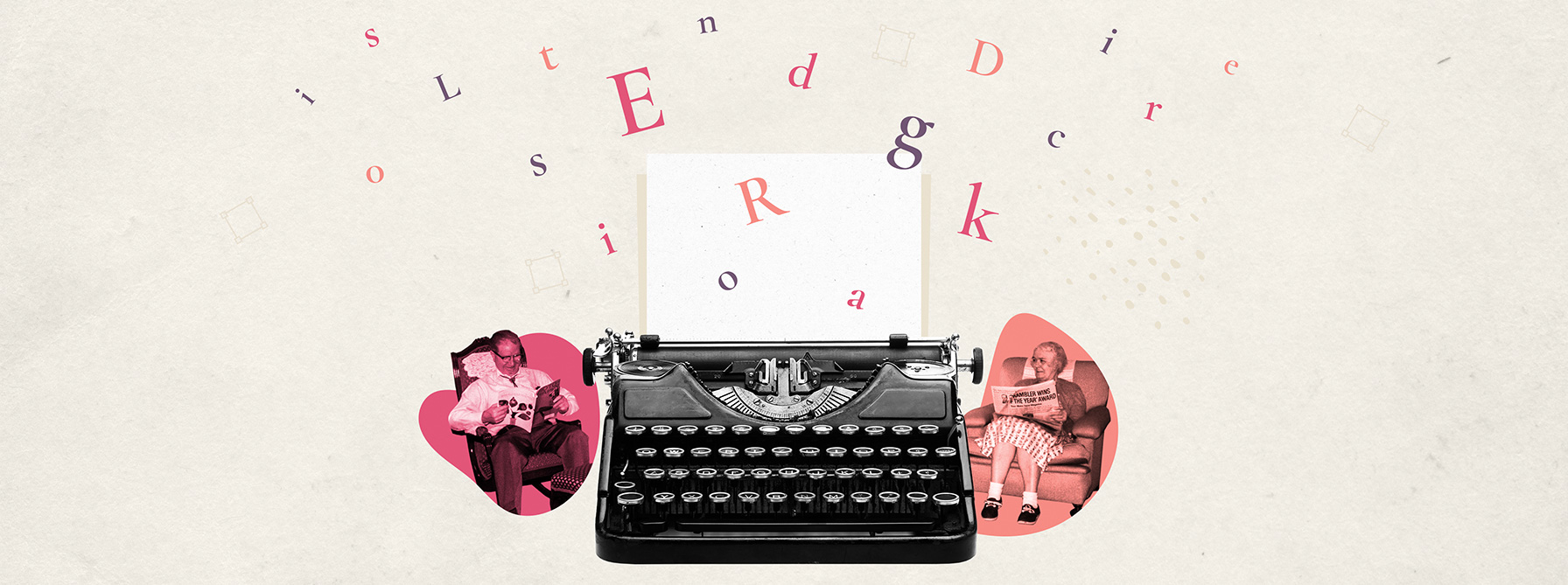
Editorial design is generally associated with print media. From newspapers to glossy magazines, the style has a strong focus on layout, typography, illustration and photography. Often taking a minimal form, it can be a powerful way to convey ideas and information.
As the senior digital designer at The Dubs, I combine ideas from editorial design into my work when I create images for blog articles, social media and downloadable pdfs. It’s a great way to grab your audience’s attention, give your content a personality and further establish a brand identity.
“ Editorial design is a great way to grab your audience’s attention, give your content a personality and further establish a brand identity. ”
Compared to the volume of uninspiring images on the internet, an editorially-led approach to imagery can really help set you apart from the competition. We’ve all come across blogs in the finance space or otherwise with the same standard and unimaginative stock imagery and gone straight for the back button. At The Dubs we were so perplexed by some of the stock imagery we saw used time and time again that we went direct to a stock model to find out what makes a stock image sellable.
Often as a digital designer in the finance sector, the challenge in my job is to deal with topics and ideas that aren’t tangible and that are also repeated. Themes in no particular order often include strategy, research, financial assets, content, investing and many more.
7 editorial design tactics that work
To help bring these themes to life there are a number of editorial design tactics that I find successful in my own work.
1. Focus on the title
Your image will be directly related to the title when viewed together on a blog or via social media, so it’s important they speak to each other and your image doesn’t focus on a different aspect of the article.

2. Good use of colour
Obviously, if you’re working to brand guidelines, then stick to them. If you have a bit of room to play with, I go for a max of three main colours. I get a lot of my colour combos from colourlovers.com
3. Integrate vintage photography
I’m a fan of using vintage photography when I can. It has a recognisable and timeless quality to it, so it speaks to all. When creating a collage-style image, it creates a nice effect to pick out certain images and turn them to black and white.

4. Match photography with colour
Combining black and white photography with colourful shapes and icons also works well together, allowing you to deal with more complex subjects than you could with just one image.
5. Tell a story through your image
The article is conveying an idea, and so should your image. This could mean focusing on one central image and surrounding it with many other types of imagery. Or the image could focus on one central theme from the article.

6. Keep it modern
As my work focuses on the digital realm it’s important to keep up-to-date and reference contemporary technologies and imagery. I do this often through the use of emojis, memes and celebrities. It’s also important to use up-to-date images of phones, logos, interfaces etc – nothing worse than seeing an old X logo or a Nokia 3310 in a recent article.
7. It’s all about the execution
I know I bad mouth stock images, but you can still find some gems in there. But don’t just download the image and be done with it. Think about whether it can be framed in a different way. Can it be used in a collage? Or could adding illustration, icons or stats over the top give it an edge? Don’t be afraid to experiment and add a number of layers to an image.
The striking editorial design you see across the Financial Marketer is a key tenet of our overall content marketing strategy. It’s a style unique to The Dubs that we’ve evolved over time and one we know works to capture attention and stop our audience mid scroll. If your design needs an editorial touch, contact The Dubs.

