Website design is a core building block of every finance brand’s digital marketing. Your website is a reflection of your brand, your product and your customer offering, giving you one shot to convert a visitor into a customer. We asked The Dubs senior digital designer, Tom Bradshaw how brands can ensure their finance website design is optimised for customer conversion.
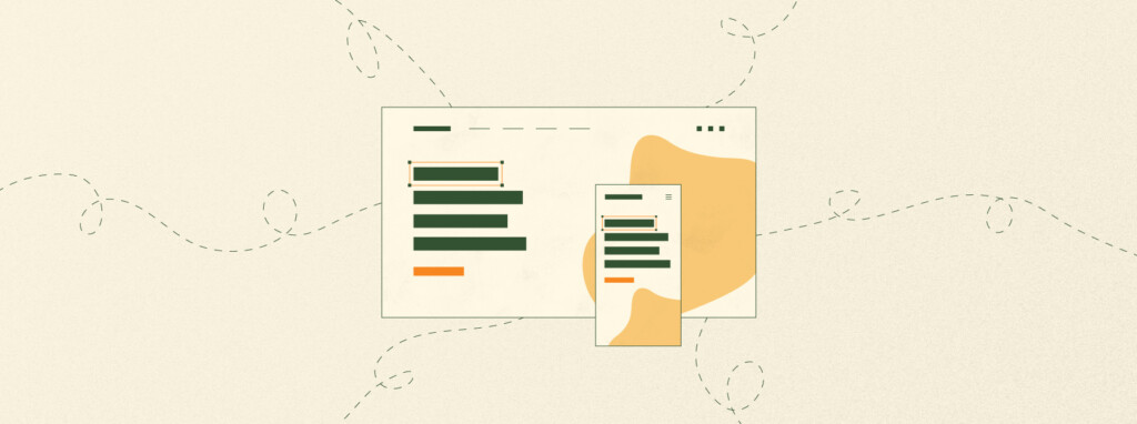
Website UX vs UI: What’s the difference?
We start off by asking Bradshaw to help us better understand exactly what ‘website design’ means, particularly with regards to users and conversion. He explains, “In this context, design is referred to as UI design (User Interface). Great website design should start with the UX (User Experience) process. This begins with research, analysis and ascertaining what is the best user experience for both your brand and the end-user or customer. From here the UI designer will take over. They will work on a design hierarchy and implement design techniques that users will interact with to achieve the desired conversion.” In order to provide a clear customer journey, both UX and UI should be considered at the start of the website design process.
Great website design should start with the UX (User Experience) process.
When it comes to designing for conversions, finance brands, in particular, must manage the sheer breadth of conversions they will be trying to achieve. As Bradshaw highlights, “A bank, for example, may have half a dozen completely different conversion funnels that it is looking to achieve within its one website, e.g. signing up to a bank account, a credit card or a home loan.” So for Bradshaw, this means the site must work much harder to simplify and streamline the experience for users. The homepage, for instance, will need to present a multitude of different options for the user. “The challenge for the UX designer and the UI designer is to find the simplest way for the user to navigate to where they want,” Bradshaw explains.
What exactly is wireframing and why does it matter when designing a finance website?
Wireframes are a design buzzword that we’ve all heard of, but how important are they? Bradshaw walks us through their purpose: “Wireframing comes before the actual design process. It is a way to illustrate the structure of the site. It is also a way to map out user needs and the user journey. As a finance content agency, wireframing is particularly beneficial as it allows us to work closely with a finance brand to finalise the structure of a website that will successfully convert, before entering design. It means that any small changes can be ironed out before design, as even a small detail can lead to large structural changes to a website’s design. Design can then take place, working over the top of the wireframes to make them look visually appealing,” he says.
Bradshaw’s top 5 tips for designing a finance website that converts
- You can’t make a silk purse out of a sow’s ear
There are many blogs out there that promise a magic formula that will work for any website. These design processes have their benefits, but ultimately it is the product you are selling or the quality of your service that will ensure you convert your customers. - Count your clicks
A great number to always bear in mind is the amount of clicks it takes for a user to get where they want. Always avoid an extra step or page that isn’t completely necessary. - Your homepage is your shopfront
It needs to draw the user in. Ensure you present a simple homepage that outlines exactly what your brand does, and quickly directs the user to where they need to go. - Calls-to-action
It’s important to not only provide clear calls-to-action but also consider a hierarchy of CTAs. For the most important CTA, try a button that stands out against the rest of the site (eg. A solid black button on a majoritively white themed site.) For secondary buttons, use either a keyline button or a button that uses the site’s colour. For less important buttons, use a grey fill with the website colour for the text.

- Imagery makes (and breaks) a website
It goes without saying but avoid cheesy, badly-lit stock imagery. If you do choose to use stock photos, source high-quality natural-looking imagery. The ideal situation would be to create your own imagery that illustrates your service or product as you can see in the case for content example on The Dubs website.

Top design mistakes to avoid
- A slow site doesn’t convert
If you choose to have large or a lot of imagery, make sure your site can handle it. Slow loading times will have an impact on overall conversions (as well as your potential SEO ranking). - Keep it simple
Make sure your message is clear, but don’t overload the user with information or jargon. Consider both the language and the imagery you use, and whether it provides your potential customer with a quick, coherent understanding of what your brand does. - Trust is everything
Users need to feel your brand is trustworthy, so it’s vital that your site communicates that your finance brand is real, genuine and already has existing satisfied customers. This can be achieved through the site’s imagery, but could also include quotes from satisfied customers as well as star reviews. - Too many fields in your forms
People are less likely to convert if you’re asking for too much info. Formstack found that by reducing forms to 10 fields or less leads to an increase in conversions by 120%.
Five finance websites using great design with a focus on conversion
We asked Bradshaw if there were any finance brands in the market that he felt were doing a good job designing for conversions, and following some of the key pointers he has highlighted to us:
- BlackRock
Bradshaw calls out BlackRock’s clean black and white design and great use of imagery, acknowledging that finding imagery that stands out in this sector can be difficult. BlackRock has put thought into abstract concepts and imagery and coupled this with nice illustration. - Nuveen
In a sea of bland and predictable designs, Nuveen stands out with its modern layout, strong use of colour and nice use of imagery and iconography. However, Bradshaw flags that the customer journey could be clearer and more streamlined. - HSBC UK
Although the layout doesn’t break the mould. The HSBC UK site is clear and to the point, requiring just a couple of clicks to get to where you want to go. HSBC is also a good example of CTA hierarchy, with its consistent use of primary and secondary buttons. The site also employs progressive, multi-cultural imagery which is an important consideration of global design. - CommBank
CommBank ensures a good user journey with a minimal amount of clicks. Bradshaw also highlights their use of imagery and iconography as a strong point. - Westpac
Bradshaw particularly appreciates the design of the four dropdown menus which take the user straight to where they want to go directly from the homepage. The personal and business sections below the dropdowns also work well as they are clean and well laid out.
Designing for conversion is a huge task with many facets to consider. If there’s one crucial takeaway from Bradshaw’s insights, it’s that it must be considered from the beginning and in every aspect of your design process. Try to look at your website with new eyes – look at it from the perspective of a potential customer and someone who has never interacted with your brand before. Ask yourself if the design of your website is making that customer’s path to conversion as easy and encouraging as it can be. At The Dubs we specialise in website UX design for finance brands. If your website isn’t working hard enough for your brand, get in touch.