In the second quarter of 2020, LinkedIn’s revenue grew by 24%. Long a place for professionals to connect, the platform is now crucial to any finance content marketing strategy.
With LinkedIn’s growth has come an ever-expanding repertoire of tools, from LinkedIn Live video to LinkedIn Stories, along with an increasingly intelligent algorithm that rewards brands whose content captures and holds attention – or dwell time.
Among the features most useful to finance brands are LinkedIn Showcase and Life pages. If done well, these pages can play a powerful role in enabling a finance brand to showcase achievements, highlight unique qualities, and share company culture. But, if done poorly, they risk coming across as showy, glib, and tokenistic.
Here, we take a look at the pros and cons of LinkedIn Showcase and LinkedIn Life pages and share some tips for getting them right.
LinkedIn Showcase pages: the pros
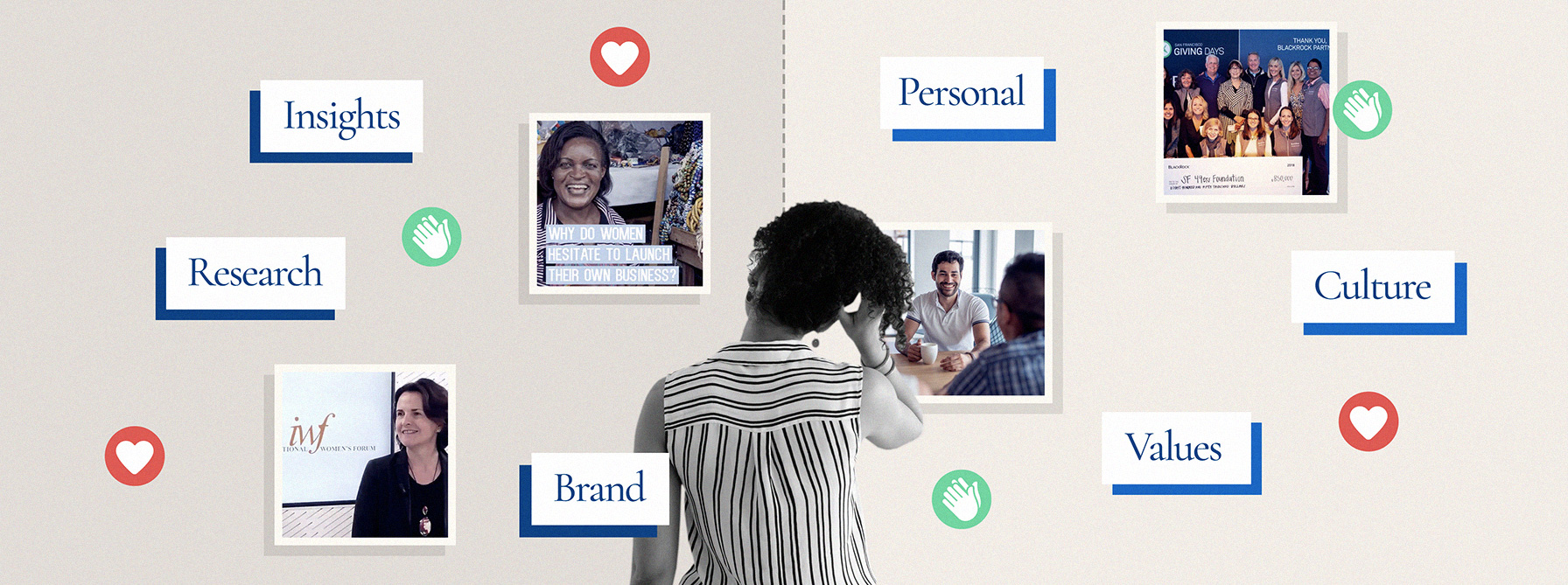
A LinkedIn Showcase page, as the name suggests, is all about showcasing your finance brand. It’s an opportunity to share the things you do best—be they revolutionary initiatives, expert research or insights, or demonstrating that you act on your values.
For inspiration, check out AXA Insurance’s LinkedIn Showcase page. It focuses steadily on AXA’s values, contributions to community, and thought leadership. Every piece of content is weighty—whether it’s an interview with the Group Chief Innovation Officer on the benefits of diversity in the workforce or a silent video that distills obstacles to female entrepreneurship.
[dianomi]
LinkedIn Showcase pages: the cons
Working out which content to include and which to leave out is challenging. To create a high-performing LinkedIn Showcase page, you must be ruthless. This is not an opportunity to convey every move your brand makes, but to communicate the best of the best, making sure your content is coherent in its tone and messaging.
“ To create a high-performing LinkedIn Showcase page, you must be ruthless.”
Nationwide, a UK-based building society, gets it right. The organisation’s LinkedIn Showcas page is almost exclusively dedicated to its community-mindedness, from revealing it has been nominated as a Responsible Business Champion to its appearance at leading conferences, such as Housing 2020.
LinkedIn Life pages: the pros
A LinkedIn Life page is all about sharing a finance brand’s personal side. Here, content should take on a bit of a behind-the-scenes feel, revealing your people, your culture and your values. As with LinkedIn Showcase pages, resist the urge to cover everything; instead, for each section, choose just one main point to put across.
One brand with an effective LinkedIn Life strategy in place is BlackRock, a New York-based global investment manager. The page features candid photos, as well as informally shot videos featuring interviews with staff members who offer multiple perspectives on working at the company, but within a limited set of themes: ambition, diversity and innovation.
LinkedIn Life pages: the cons
Getting the tone right on a LinkedIn Life page can be tricky. It’s important to come across as personable and approachable, yet trustworthy and authoritative.
UBank, an Australian all-digital bank owned by National Australia Bank (NAB), strikes the right balance, by portraying its start-up-style culture with photos and one-to-one interviews that emphasise technological innovation, collaboration and forward-thinking. Added to this are impressive stats, such as the fact that UBank’s 310-strong team handles the finances of more than 600,000 Australians, and achievements, including UBank making the Best Places to Work in Australia Awards two years running.
Is it time to launch a LinkedIn Showcase or Life page of your own—or give your existing ones a makeover? Get in touch.


